One thing defines a successful staging - a fast sale. Empty rooms look smaller, cold and uninspiring. For me, to stage it right, it's not only show potential use of the space by furniture placement, rather creating a one of a kind atmosphere that foster "want to have it" emotion. Thanks to Valitalia store for their great selection of furniture, art and accessories. The result - the most problematic units are sold in a heartbeat.
Scale me up.
One of the biggest mistake people do when furnishing room is not considering the scale and proportions.
The console table is way to small. Mirror - too small and hanged way too high for it's size. The space look naked and uninspiring.
YOUR GRAND ENTRANCE SHOULD BE GRAND... [even if you have a tiny place]
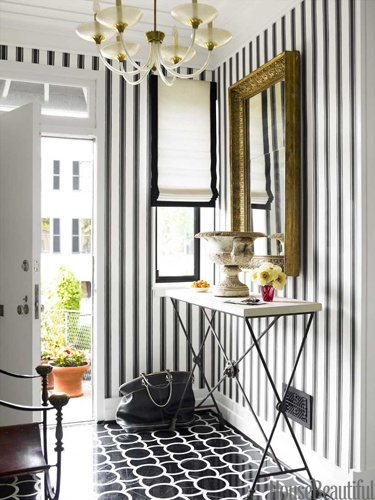
Designed by Hillary & Jeff Lincoln featured in
House Beautiful MagazineEntrance, Foyer, Lobby... call it however you want, but this is the space that should never be left ignored. This is the place where your house greet the world... or you for this matter, and anyone who gained the invite to your sanctuary. This is the place to set ever lasting first impression, the space that set the tone for the rest of the house, giving a hint of what to expect, and this is the place that largely left neglected or totally forgotten. Viewed as very unimportant place, many builders shrinking square footage of this space to a minimum, some completely abolishing them, though nothing can be less unwelcoming then stepping straight into a seating room.
So if your entrance isn't so GRAND - make it feels like one. Here's some ideas and inspiration.
It’s a perfect space to go with bold paint, prints or to cover wall with wallpaper.
As I pointed out on my previous post "Mirror mirror on the wall..." small places need large mirrors, it visually enlarge area, making it feel lighter and brighter. Go for full length mirrors, they will fulfill your craving for the glance of approval heading out off the door. Framed artwork will add more personality.
Find a place to fit consul table, even a small one, a shelf would do the job too. Arrange on it a decorative plate or a small basket to have a designated place for your keys (it will save you tons of time wasted searching for them). Small vase with flowers or a plant and other decorative elements would spice up the room.
Designing entrance room make sure it's not only beautiful but a functional as well. If your space allows put a bench or chair. Don't forget few hooks to hang outside clothe or standing coat hanger. I personally like to have a dressed in my foyer, great place to keep there my scarves, gloves and all other small accessory to add last minute touch ups before leave house.
Be bold, be fearless, be Glamorous and make your places be the same!
Want us to Create your space to reflect your personality, please contact us
MIRROR MIRROR ON THE WALL, DOES MY ROOM LOOKS LARGE AND TALL...
From tiny start up unit to downsized apartment we learning the art of living small. Though constricted within four walls you still want to have a feel of ease and openness. So, if you feel claustrophobic - mirrors are your best friends. They not only visually enlarge space, but strategically placed mirror will reflect the light which will brightens up your room. There is no rule of thumb in choosing the right one. It has to reflect not only you but your personality and style. Tall mirrors visually lift up ceiling making your room looks not only big but tall. From multiple once hanging on the wall to a supersized one standing on the floor, properly chosen mirror will add sophistication and elegance to the space.
Mirrored furniture is a big trend right now. You can find it in most stores at every price point. Just keep it simple, don't overwhelm your room.
Don't forget accessories. Add things that reflect light adding touch of glamour and dimension to your space.
Love your places and your spaces. Be Creative, let them reflect your personality not your budget!
All images courtesy of Pinterest - great resource of inspiration.


